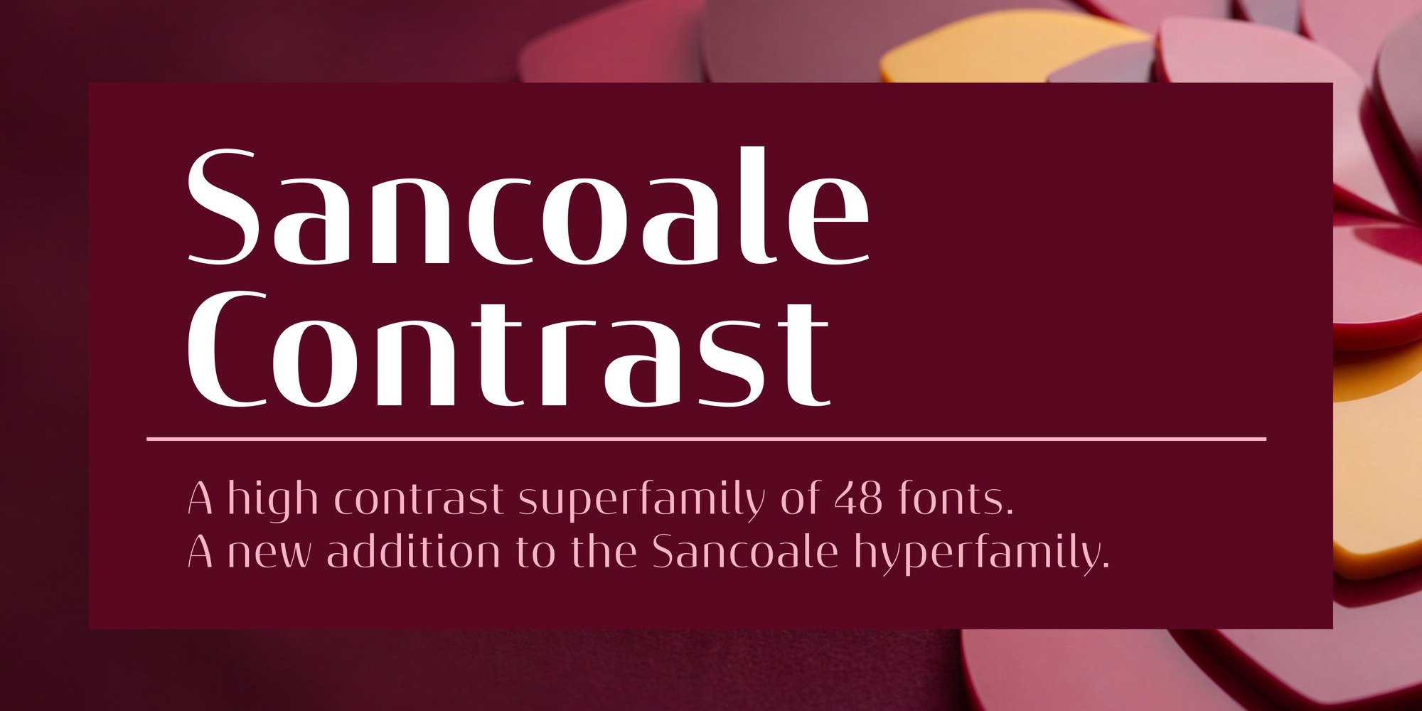
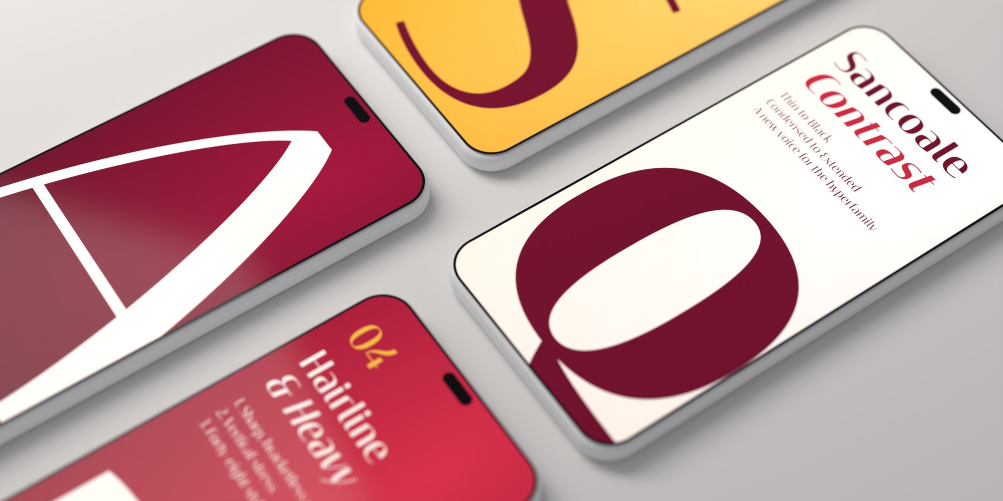
Sancoale Contrast is out today. If it had to be one word, it would be poise: a high-contrast sans in 48 styles, and the third member of the Sancoale family.
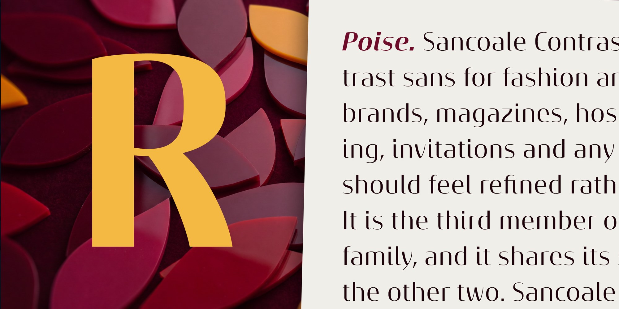
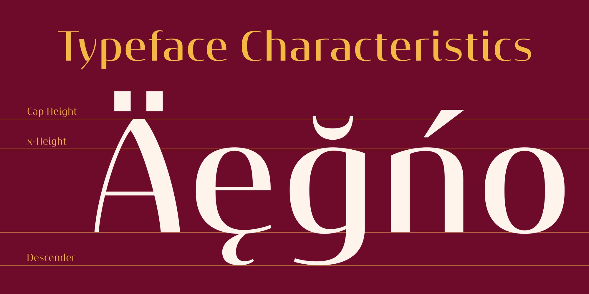
Where it comes from. Sancoale began as a clean, even-stroked sans. Sancoale Gothic added a measured amount of stroke modulation. Sancoale Contrast takes that idea all the way. The stems stay firm, while the curves and joins thin to fine hairlines. The result catches the light like a display serif, but keeps the open, plain structure of a sans.
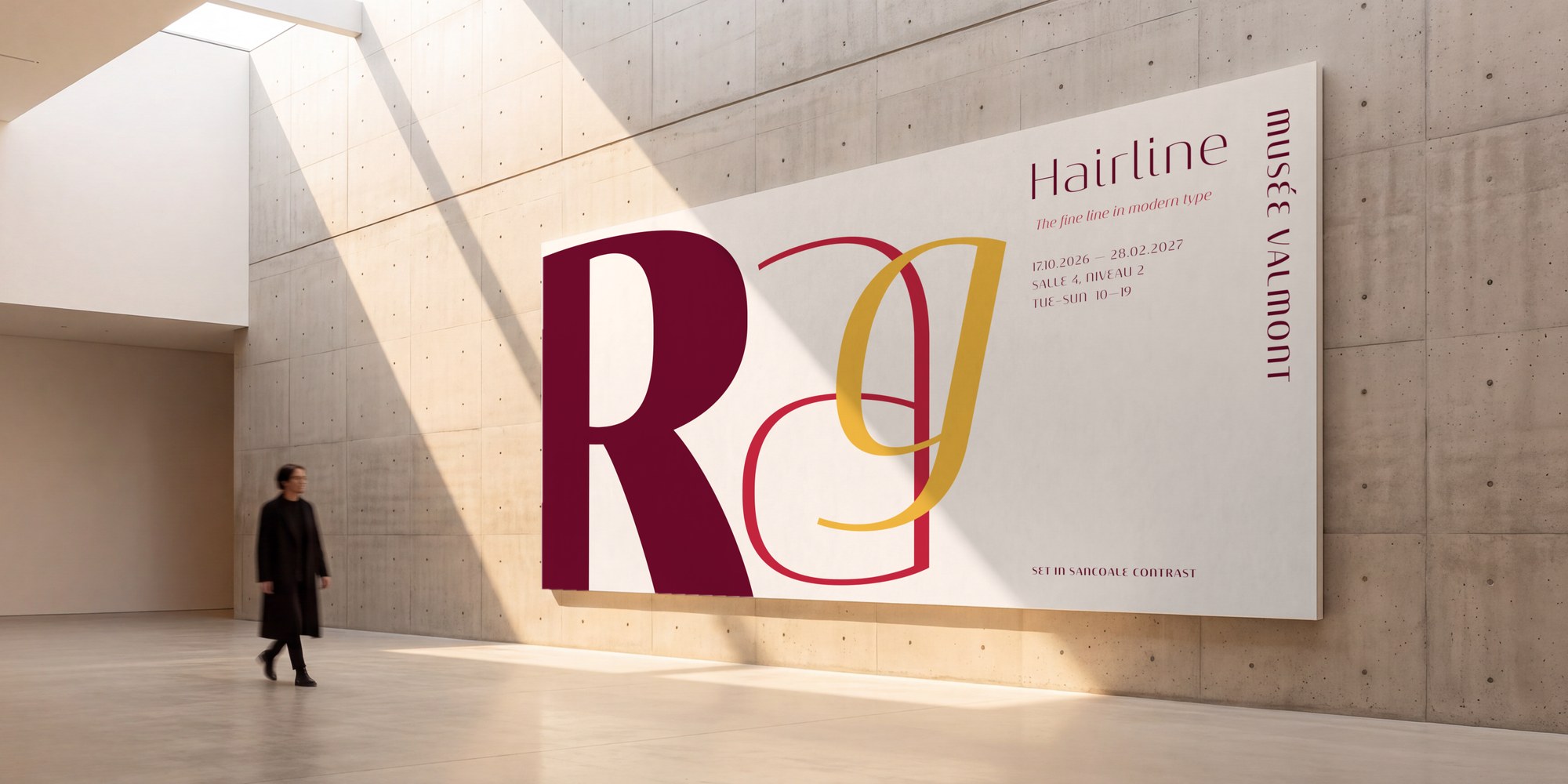
The range. There are eight weights, from a delicate Thin to a dramatic Black, in three widths. Cond is for tight headlines and narrow columns, the standard width is for everyday setting, and Ext is for logos, wordmarks and signage. Every style has an italic, which makes 48 fonts in all.
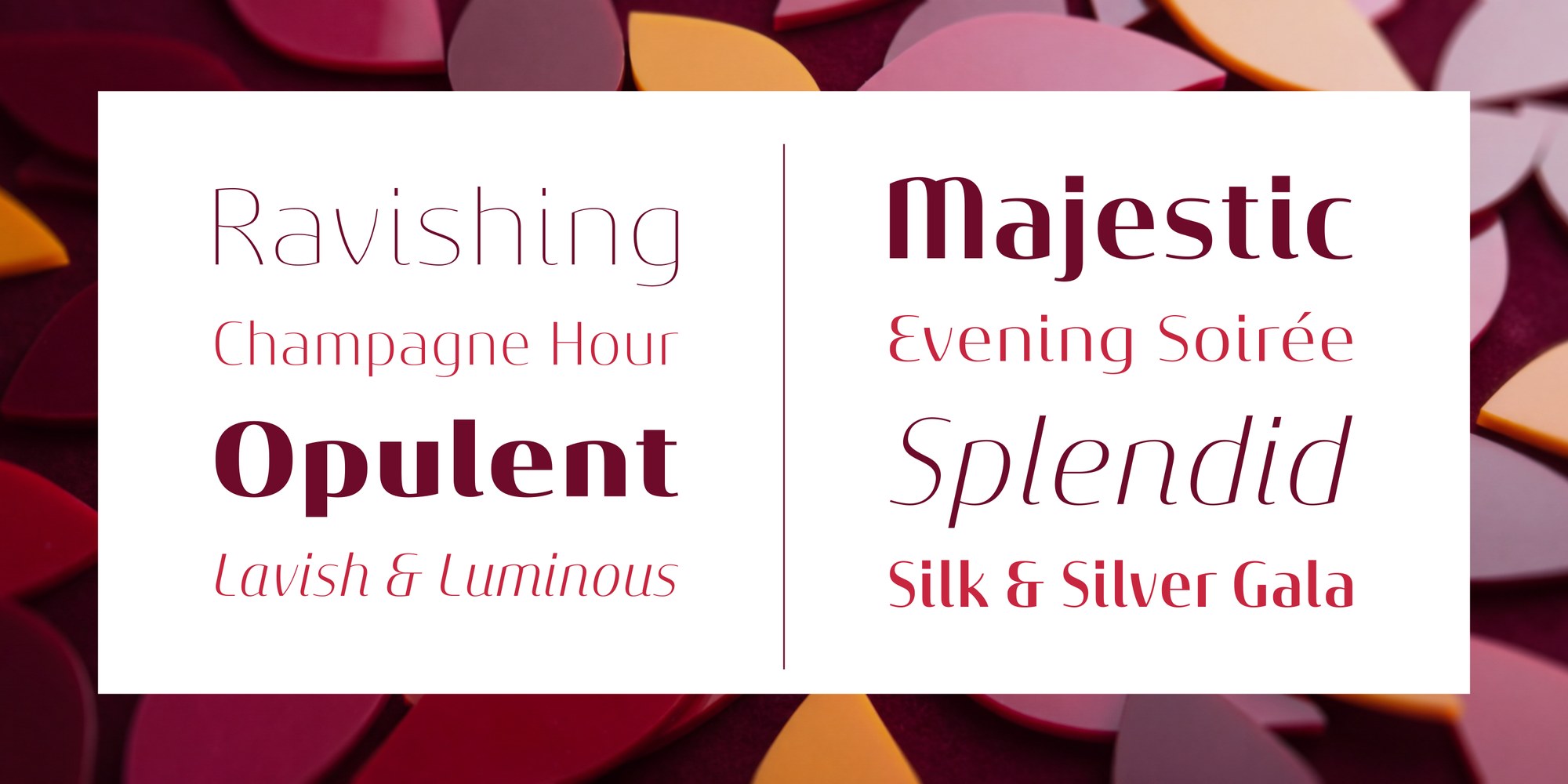
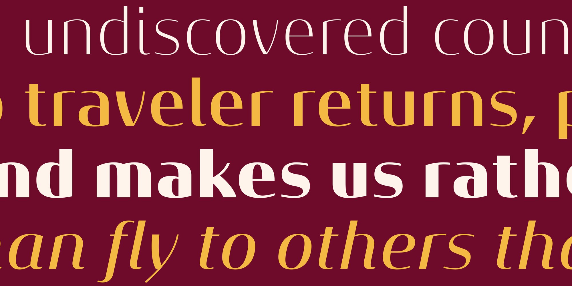
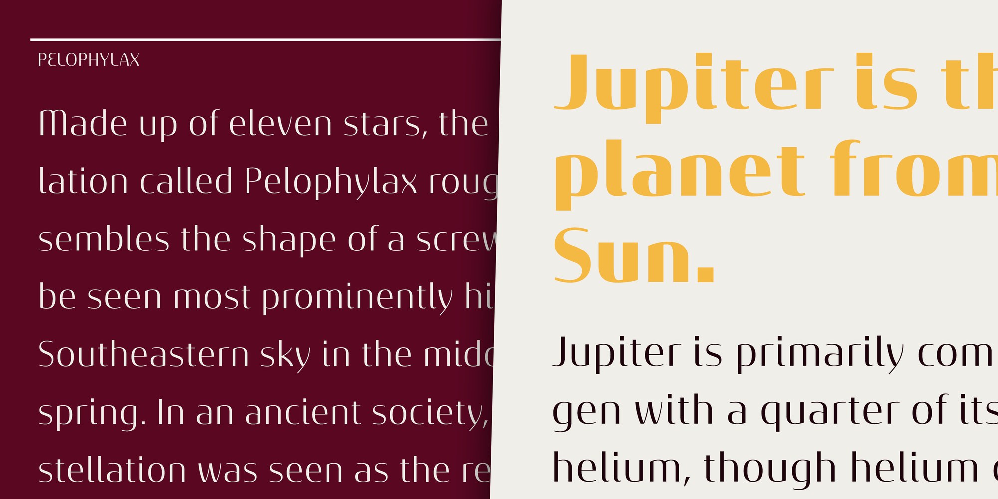
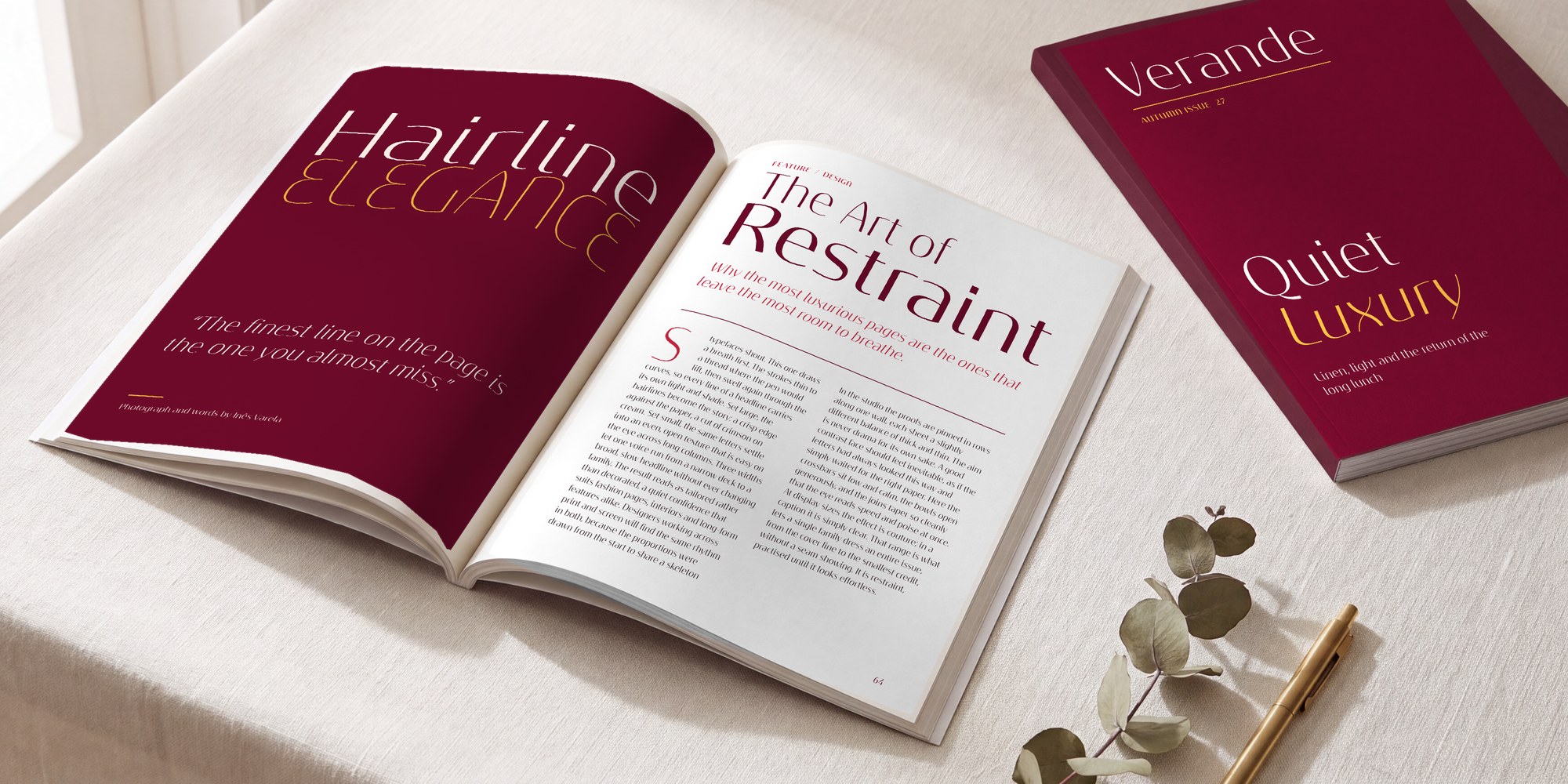
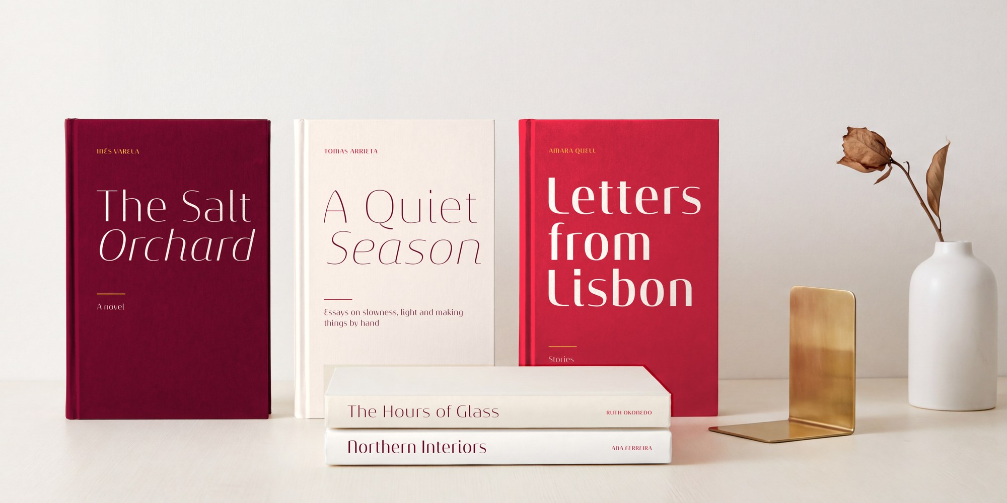
The lighter weights shine at large sizes, where the hairlines are at their most striking. Book and Regular hold up in short texts, menus and captions. Bold and Black bring real presence to posters, covers and packaging.
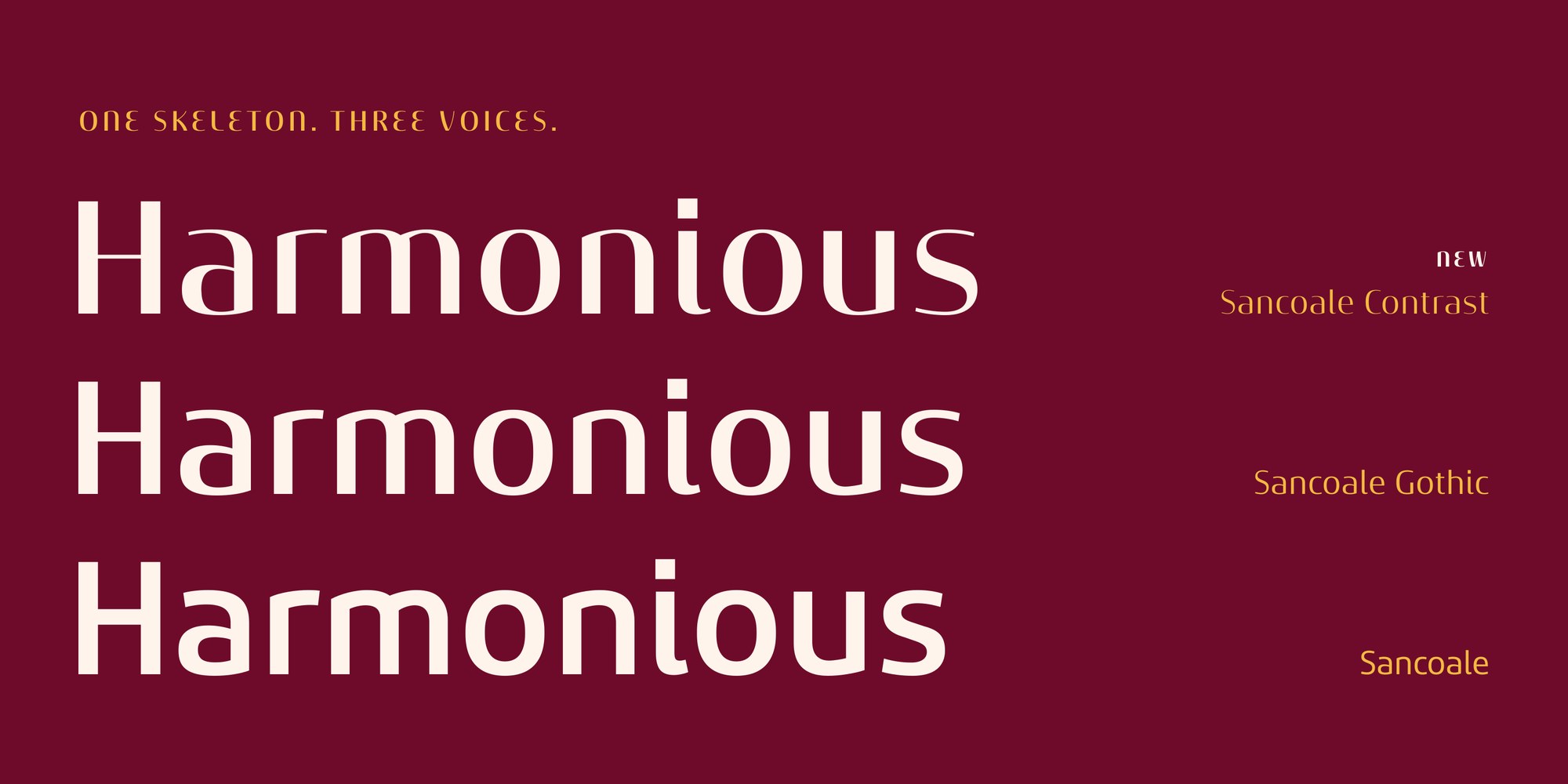
One skeleton, three voices. Because the three Sancoale families are built on the same bones, they work together without effort. Set a headline in Contrast Black, a subhead in Gothic and the body copy in Sancoale, and the page still reads as one voice.
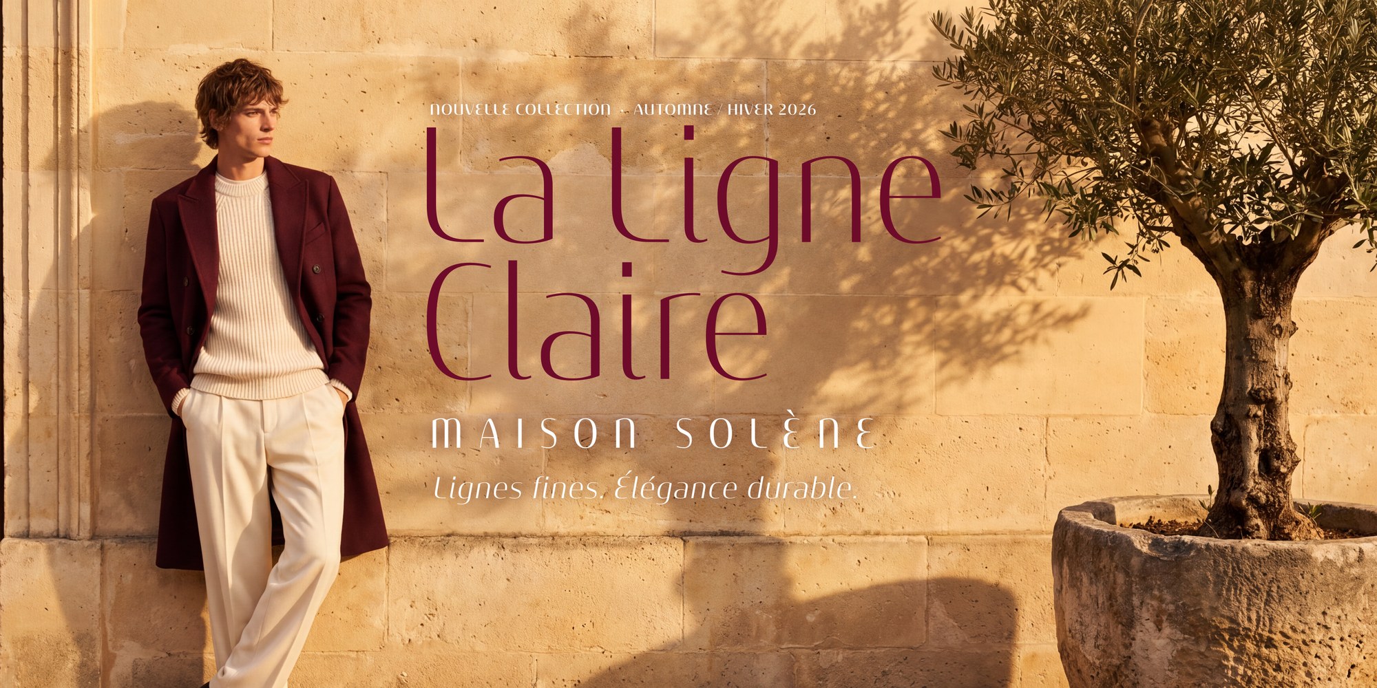
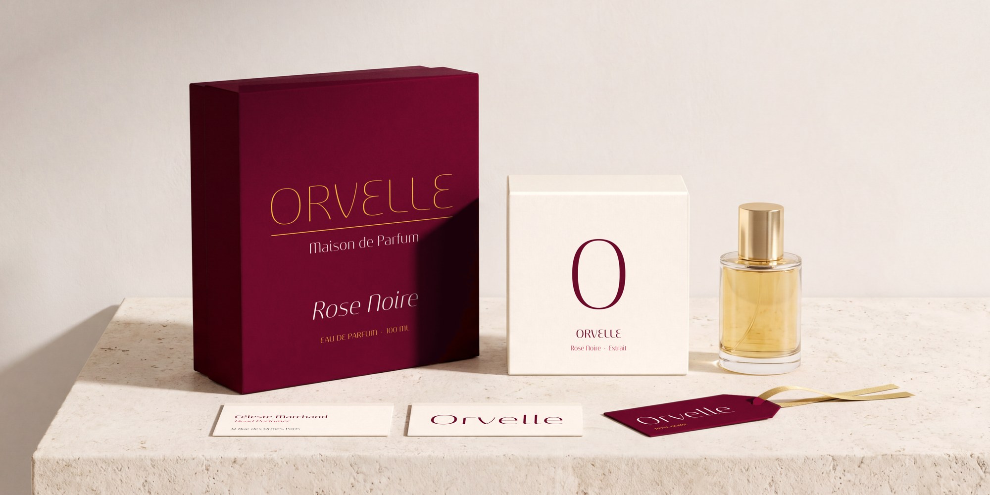
In use. I made the face with fashion and beauty brands, magazines, hospitality, packaging and invitations in mind.
Inside the fonts. Sancoale Contrast includes small caps (with caps to small caps), titling capitals, swash and stylistic alternates, standard and discretionary ligatures, historical forms with the long s, oldstyle and tabular figures, fractions, superiors and inferiors. It covers 302 Latin-script languages.
What's next. A variable font that spans Sancoale, Sancoale Gothic and Sancoale Contrast across weight, width and contrast is on the way.
Sancoale Contrast is available now on MyFonts: https://www.myfonts.com/collections/sancoale-contrast-font-insigne
Comments