Introducing Cabrito Mezzo

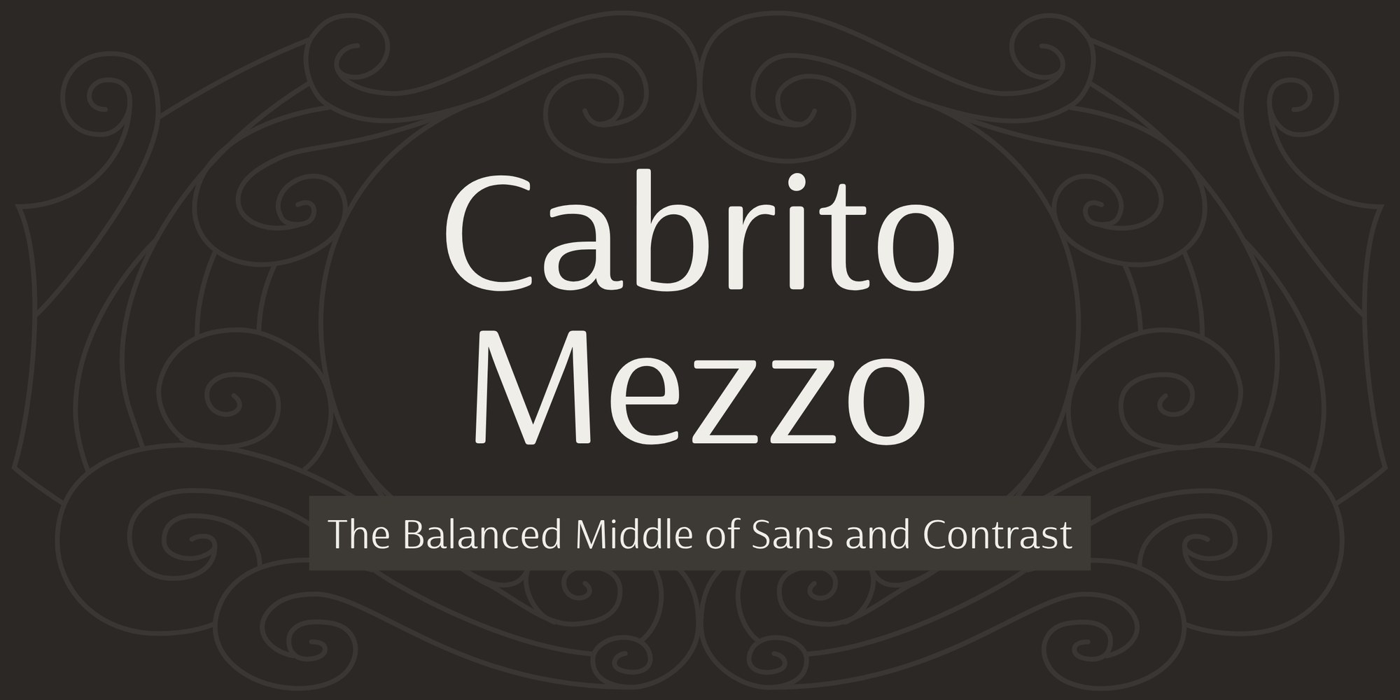
Cabrito Mezzo in large cream letters on a dark scrollwork background, with the line The Balanced Middle of Sans and Contrast.

Every Cabrito family has its own personality. The original Cabrito was drawn for a children's book, The Clothes Letters Wear, to be light-hearted and easy for young readers. Cabrito Sans kicked off its shoes and relaxed, with soft, rounded forms and sans between its toes. Cabrito Contrast dressed up for the evening in crisp thicks and thins. Today I'm introducing the newest member of the family, Cabrito Mezzo.

Mezzo is the sibling who gets along with everyone. I wanted something smart enough for the dinner party and comfortable enough for the picnic, so Mezzo sits right between the other two. Its strokes carry just enough contrast to give a headline a little sparkle, while text stays calm and easy to read. It picks the best letters from both sides of the family, pairing the lively, open curves of Cabrito Contrast with the sturdy, dependable shapes of Cabrito Sans.
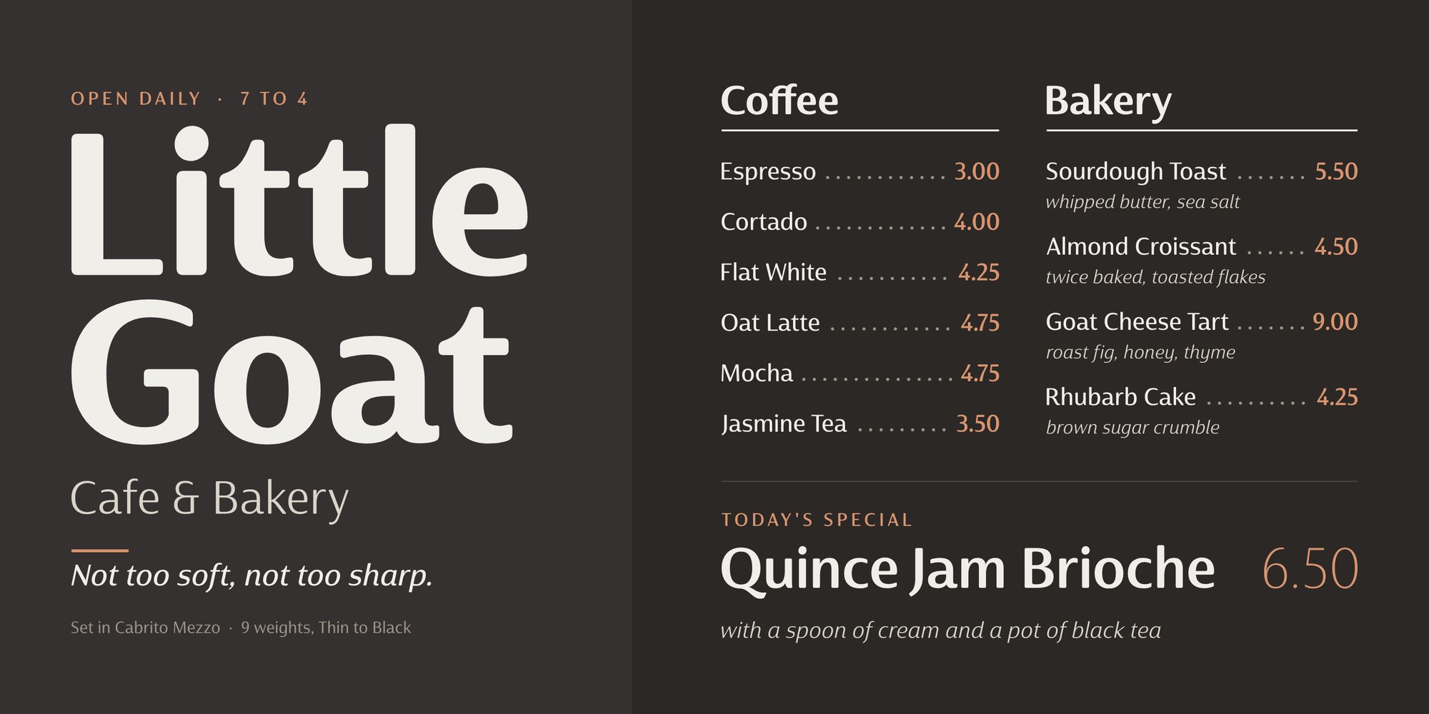
A café menu for Little Goat Cafe and Bakery set in Cabrito Mezzo.

So what is it for? Mezzo is for projects that should feel warm and welcoming but still look grown up. Think of a bakery box, a café menu, an ice cream lid, a cereal brand that wants to look a little more sophisticated, a picture book with a confident title, or a zoo map. Where Cabrito Sans can feel too casual and Cabrito Contrast too formal, Mezzo is just right.
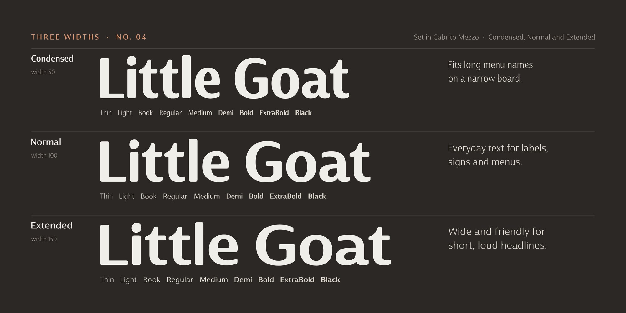
Little Goat set in Cabrito Mezzo Condensed, normal and Extended, with the nine weights listed under each.

The family has 54 fonts. There are nine weights, from a delicate Thin to a hearty Black, in Condensed, normal and Extended widths, and every one has a true italic. That gives you a narrow cut for packed labels and signs, a wide one for confident headlines, and a full range in between.
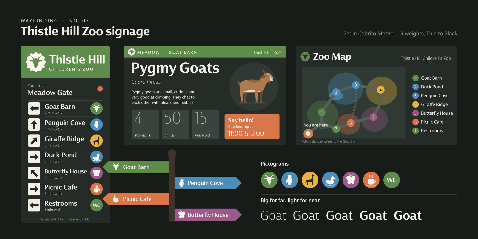
Wayfinding signs, a zoo map and pictograms for the fictional Thistle Hill Children's Zoo set in Cabrito Mezzo.

There's plenty to play with, too. Do you like your letters rounder or crisper? Two stylistic sets swap in the softer Sans forms or the sharper Contrast forms with one click, and a third turns the lowercase italic-flavored. Tailed swash letters add a skip to a headline. Small caps, playful alternates, oldstyle figures for running text, tabular figures for prices and menus, ordinals and f-ligatures are all included, and Mezzo supports more than 270 Latin-based languages.
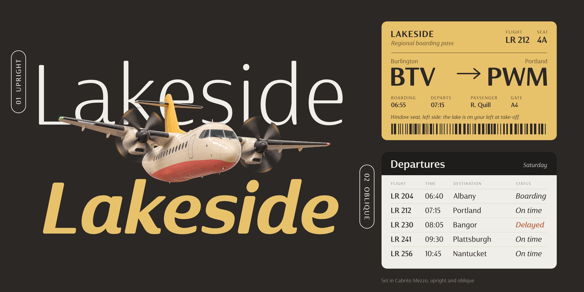
Lakeside set upright and in italic behind a small propeller plane, with a boarding pass and a departures board.

Use Mezzo alongside Cabrito Sans and Cabrito Contrast, or let it carry the whole project on its own.

Cabrito Mezzo is available now from Insigne on MyFonts: https://www.myfonts.com/collections/cabrito-mezzo-font-insigne

Give your next project the best of both Cabritos.

Comments

Popular posts from this blog

New from insigne: Aviano Contrast

The Aviano series returns, refined and sophisticated with an extended, high-contrast sans-serif family.  Aviano Contrast is a contemporary typeface radiating with luxury. It’s classic elegance makes it perfect for high-end applications such as cosmetic, jewelry or fashion brands. Aviano Contrast’s extended forms give the face a smart look, and the curves are carefully honed to be sinuous and seductive. This high-contrast face is in a class of its own, composed in the style of a classic Didone but lacking the typical serifs. Aviano Contrast comes in six different weights and is packed with OpenType features. Need swash forms? Ball terminals? Art Deco alternates inspired by the inscriptions and signage of the ’20s and ’30s? Aviano Contrast includes 230 alternate characters. Twelve style sets are available, including four complete sets of art deco-inspired alternates, small forms, swash, titling and a wide array of other alternates to make your designs unique. As a complement t...

New from insigne: Mynaruse

Mynaruse is an elegant and regal roman inscriptional titling family. It has sharp and elongated serifs that give the face extra punch. The face shines in settings that call for elegance and splendor. Mynaruse’s six weights range from a fine, delicate thin to a powerful and solid heavy weight. Mynaruse includes many useful OpenType features, including a set of swash alternates, alternate titling forms, ligatures and miscellaneous alternates. OpenType-capable applications such as Quark or the Adobe suite can take full advantage of the automatically replacing ligatures and alternates. This family also includes the glyphs to support a wide range of languages. Mynaruse is 1/3rd off for a limited time!

New from insigne: Sommet Serif!

The Sommet superfamily has been updated with a new serifed member. Expanding on Sommet’s successful design principals, Sommet Serif is there when you need legibility for continuous text. Its interesting forms lend it to use as headlines as well. Sommet Serif is available with six weights and complementary italics and plenty of OpenType features. Sommet Serif features a tall x-height, and its letterforms are compact, perfect for when layout space is at a premium. Sommet Serif also includes oldstyle figures and small caps. Use Sommet Serif whenever you need a powerful and contemporary serif. In addition, be sure to check out the sans, rounded, and slab members of the superfamily. 1/3rd off for a limited time!