Using Layered or Chromatic Type
Have you seen those fancy new layered type styles that all the cool kids are using? Ever wonder how to use them most efficiently? Layered type is great when you want to set headlines in a application that screams for attention. It's fantastic when you want a retro or vintage feel or just want to add some depth and dimension to your work.A Bit of History
If you will forgive the pun, layered type is a multifaceted contemporary trend in type design. Layered type finds it's origins in woodtype, which came to the fore in the mid 1800s. Another implementation came in the time of Letraset. In the present day, we stack layers of type in a digital program and output the results, but in the past there was great deal of trial and error and less versatility. Some of the challenges of designing layered type, such as registration, are now mostly the domain of the designer of the layered type family.Tips On How To Use Layered Type
We will only go into the Adobe applications. Just about any visual application, such as InDesign or AfterEffects could achieve these effects. Something like Microsoft Word, while possible, is probably not the best choice.Alignment is key. Generally, that's the type designers job. Can you imagine the registration issues back in the days of wood type? We are truly blessed. However, some unique effects can also be achieved by offsetting layers, for example, an outline offsetted on top of the primary yields an interesting result.
Using type that is layered is relatively simple as long as you have an application that supports layers. The letters should stack very nicely on top of each other and you can achieve different effects by coloring the different layers differently.
In Photoshop, I like to just copy the layer in place by dragging the layer I want to duplicate to the new layer icon.
When it comes to Illustrator, paste in place is your new best friend. Paste in place will copy the layer or object and then paste it directly on top of the copied item. Otherwise, the object is pasted in an offsetted position, and aligning it properly is a long and unnecessary task.
Every once a while you come across a particularly full-featured type family that also includes swash alternates or other open type features. You can use these features just as you normally would, but you need to remember to activate features for each layer of your stack.
Below is a video demonstration of how to use layered type.
When you want to use layered type styles, you are using them as display type. In this case you are probably not drawing a text box for paragraph text, but rather just clicking once with the type tool. Utilizing the one click type tool, you have an editable text box that you can re-position easily, but text cannot flow. There may be some occasions when you do not want to do this and actually have an extended amount of text, for example, a restaurant menu.
In some cases you may need to activate the following in illustrator. Type->Area Type Options-> Em Box Height.
Antialiasing
In some instances you may find that you need to change the anti-alias settings in order for smaller type to line up properly. You can do this in Photoshop by clicking on the smooth or sharp options. The reason that you may need to do this is because these different settings determine how the type is rasterized, or converted into pixels. Sometimes the algorithm takes factors into account that are counterproductive for layered type.
Thank you watching this brief tutorial. I hope that you found this tutorial helpful. If you have any questions or comments, I invite you to share them below.
Landmark
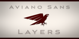
Aviano Sans Layers

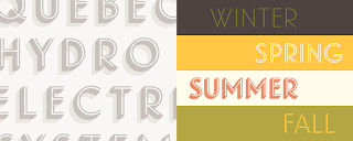
Festivo Letters

Thank you watching this brief tutorial. I hope that you found this tutorial helpful. If you have any questions or comments, I invite you to share them below.
Highlighted Layered Type Families

Landmark

Aviano Sans Layers

Festivo Letters


Comments