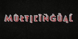
Introducing Le Havre Layers


With this charming new layered typeface, the possibilities are as endless as your vision behind them. Accomplish the effect you searching for by layering these exceptional fonts and altering opacity and color for a unique custom appearance that yells "hello there!"


Play around a bit with the potential of Le Havre Layers. Build effects which include realistic 3D appearances reminiscent of the storefronts of old and adding centerlines, dotted centerlines, and shadow variations. Inspired by the affable appearance of vintage signage from the 1930s to the 1960s, Le Havre Layers spacing is altered from Le Havre Titling's to accommodate shadows and other options properly. With its generous width it sends a message of refinement and grace. The geometric and art deco curves are a beautiful addition to your work.


Mix an' match it together with the other members of the Le Havre Hyperfamily. There are many amazing design solutions for you to discover. See what you could build with Le Havre Layers!

Comments

Popular posts from this blog

Microsoft Expression

I have been trying out the Microsoft Expression web design program recently. My final verdict: I like it better than Dreamweaver. I’ve been using Dreamweaver for 5 years now, but where Expressions really shines is its handling of CSS, which is, in my mind, quite a bit better than Dreamweaver. My “problem” with CSS as opposed to tables is that with tables you can visualize what you are doing. CSS is a bit more programmatic. Expression helps a bit. If you are looking to save some money, and you use a PC, you should download Visual Web Developer. You can do some very advanced stuff with this program, and the interface is very much like Expressions. The price is right: free! However, Expression is more intuitive in how it handles CSS. It’s very interesting how Microsoft is starting to head into Adobe’s turf. Microsoft is working on equivalents to everything in Adobe’s product line. My long term bet is on Microsoft.

Carta Marina

Carta Marina is based on the titling found on the famous map drawn by Olaus Magnus in 1539. The map of northern Europe took 12 years to complete, and the total size is a huge 1.7 meters tall by 1.25 meters wide. More information about the map, as well as the high resolution reference document used to create the typeface and illustration set can be found at the James Ford Bell Library, University of Minnesota. The titling is slightly aged, very sturdy and elegant. Carta Marina includes a full set of OpenType alternates for every character in the English alphabet, oldstyle figures, historical forms, small caps and 64 discretionary ligatures. These ligatures are used to alter the appearance of the type so that the printing appears realistic and without any duplicate letters to detract from the antique appearance. The Carta Marina family also includes some of the unique illustrations that give the map much of its character. It includes depictions of fanciful sea creatures, land animals a...

New from insigne: Mynaruse

Mynaruse is an elegant and regal roman inscriptional titling family. It has sharp and elongated serifs that give the face extra punch. The face shines in settings that call for elegance and splendor. Mynaruse’s six weights range from a fine, delicate thin to a powerful and solid heavy weight. Mynaruse includes many useful OpenType features, including a set of swash alternates, alternate titling forms, ligatures and miscellaneous alternates. OpenType-capable applications such as Quark or the Adobe suite can take full advantage of the automatically replacing ligatures and alternates. This family also includes the glyphs to support a wide range of languages. Mynaruse is 1/3rd off for a limited time!