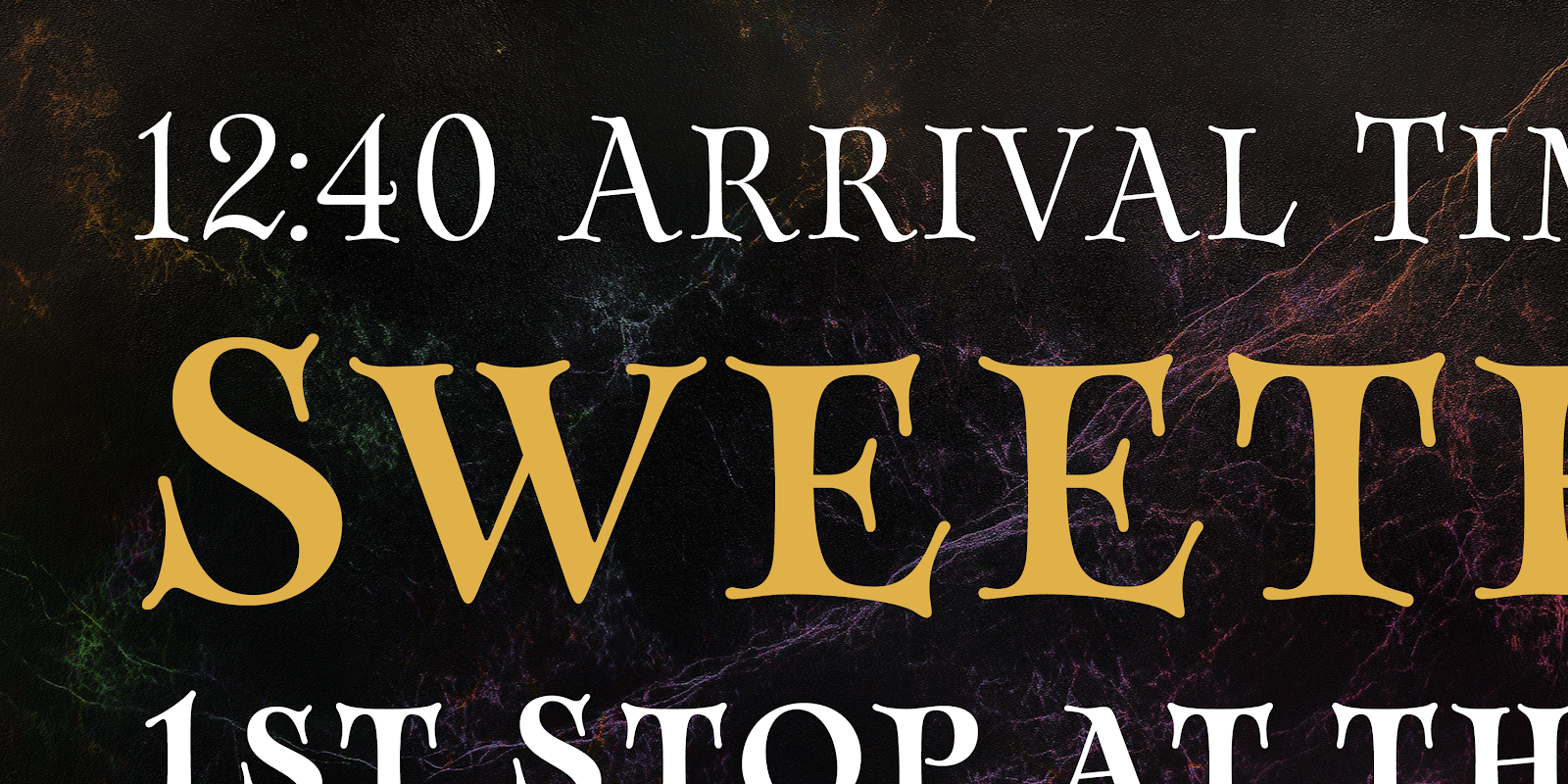
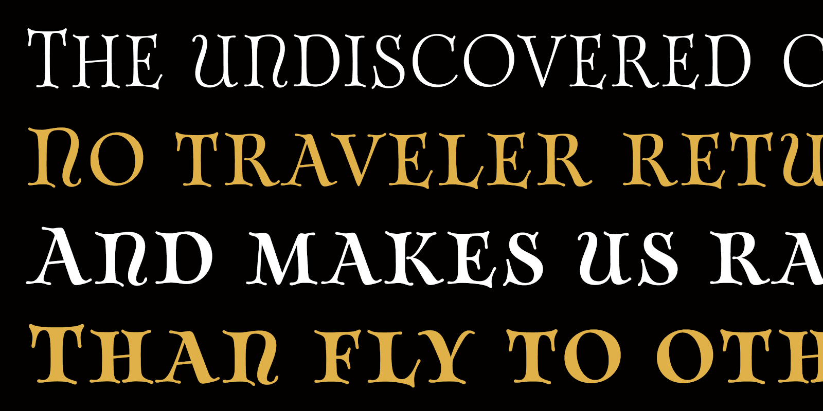
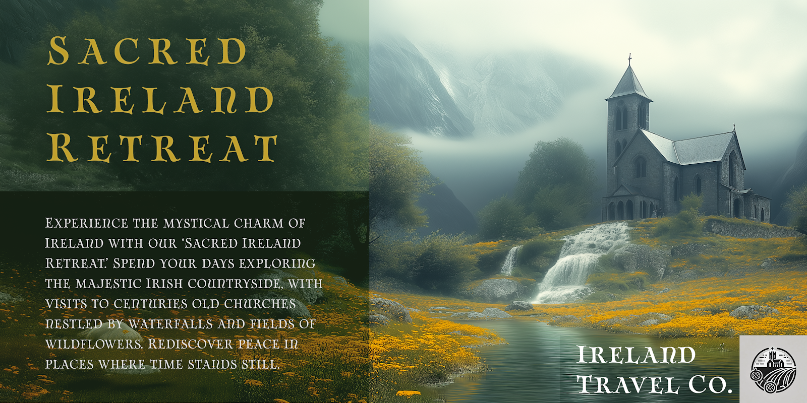
Rossglen: Unleash your Saga.


Embark on a typographic odyssey with Rossglen - where ancient uncial grace meets Viking ferocity. This isn't just a font; it's a portal to a world where Ireland's misty hills echo with battle cries and longships slice through northern seas.


Imagine your words etched in runes that flow like Celtic knotwork, yet strike with the precision of a Norse axe. Rossglen's characters dance on the edge between fluid manuscript curves and the stark geometry of weathered runestones. It's the perfect weapon for designers ready to conquer titles, forge unforgettable logos, or craft headers that command attention.


But Rossglen isn't just about raw power. Its range of weights lets you whisper legends or roar sagas. Alternate characters and ligatures are your secret arsenal, infusing designs with an air of ancient mystery. And with robust multilingual support, your message will resonate in any tongue, from Old Norse to Modern English.


Who is Rossglen for? The bold. The visionaries. The creators who hear the call of distant shores and forgotten kingdoms. Whether you're breathing life into a fantasy epic, branding the next cult favorite brewery, or titling a game destined for Valhalla - Rossglen is your rune-carved key.


Don't just choose a font. Unleash a legacy. With Rossglen, every character tells a story, every word becomes legend. Are you ready to write yours?


Comments

Popular posts from this blog

Microsoft Expression

I have been trying out the Microsoft Expression web design program recently. My final verdict: I like it better than Dreamweaver. I’ve been using Dreamweaver for 5 years now, but where Expressions really shines is its handling of CSS, which is, in my mind, quite a bit better than Dreamweaver. My “problem” with CSS as opposed to tables is that with tables you can visualize what you are doing. CSS is a bit more programmatic. Expression helps a bit. If you are looking to save some money, and you use a PC, you should download Visual Web Developer. You can do some very advanced stuff with this program, and the interface is very much like Expressions. The price is right: free! However, Expression is more intuitive in how it handles CSS. It’s very interesting how Microsoft is starting to head into Adobe’s turf. Microsoft is working on equivalents to everything in Adobe’s product line. My long term bet is on Microsoft.

New from insigne: Mynaruse

Mynaruse is an elegant and regal roman inscriptional titling family. It has sharp and elongated serifs that give the face extra punch. The face shines in settings that call for elegance and splendor. Mynaruse’s six weights range from a fine, delicate thin to a powerful and solid heavy weight. Mynaruse includes many useful OpenType features, including a set of swash alternates, alternate titling forms, ligatures and miscellaneous alternates. OpenType-capable applications such as Quark or the Adobe suite can take full advantage of the automatically replacing ligatures and alternates. This family also includes the glyphs to support a wide range of languages. Mynaruse is 1/3rd off for a limited time!

New from insigne: Sommet Serif!

The Sommet superfamily has been updated with a new serifed member. Expanding on Sommet’s successful design principals, Sommet Serif is there when you need legibility for continuous text. Its interesting forms lend it to use as headlines as well. Sommet Serif is available with six weights and complementary italics and plenty of OpenType features. Sommet Serif features a tall x-height, and its letterforms are compact, perfect for when layout space is at a premium. Sommet Serif also includes oldstyle figures and small caps. Use Sommet Serif whenever you need a powerful and contemporary serif. In addition, be sure to check out the sans, rounded, and slab members of the superfamily. 1/3rd off for a limited time!