
Eigerdals Slab: Add warmth to designs with this cozy, versatile, and friendly font.


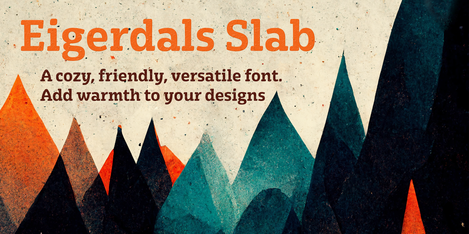
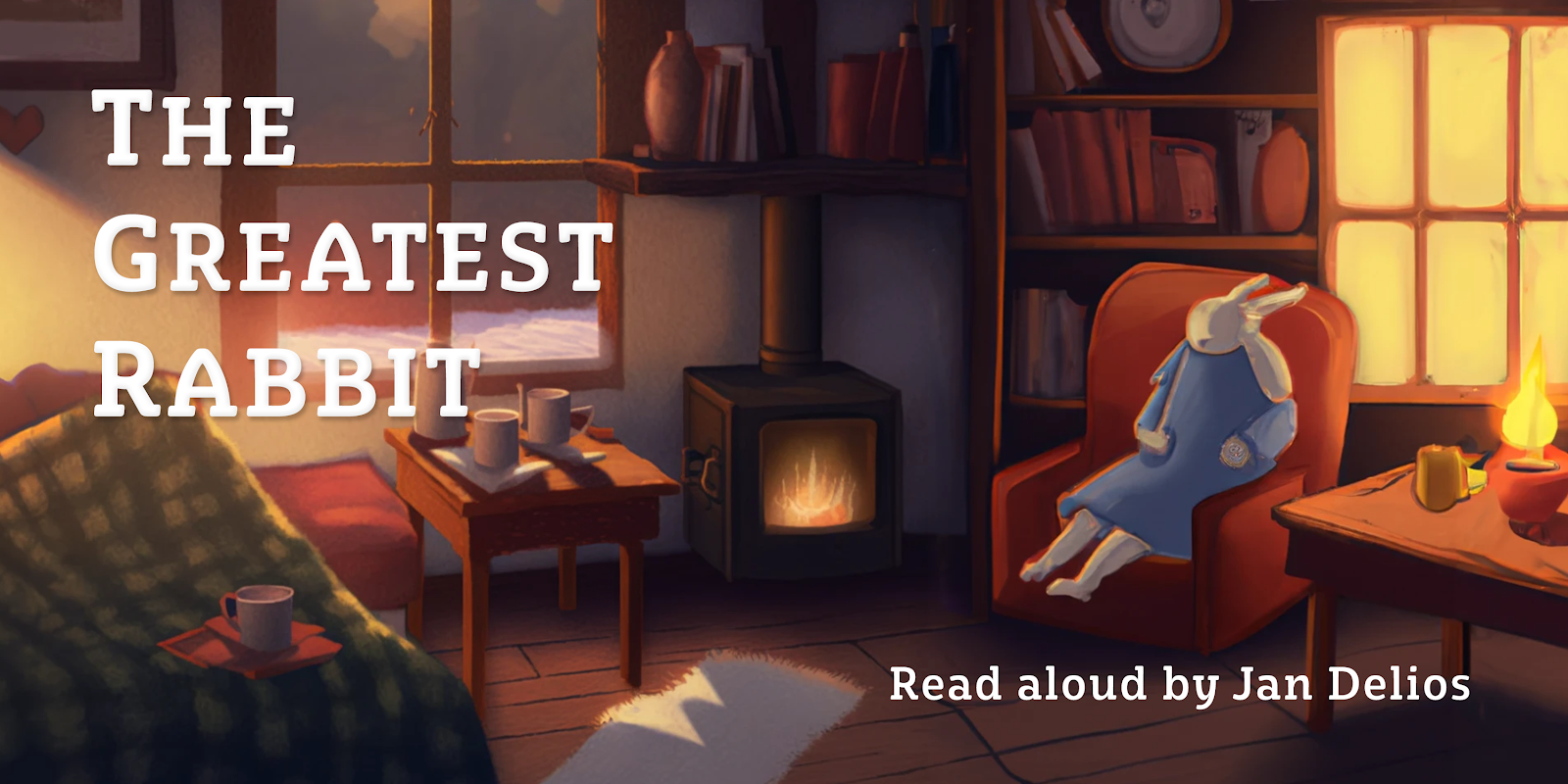
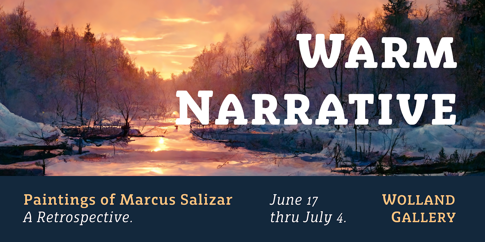
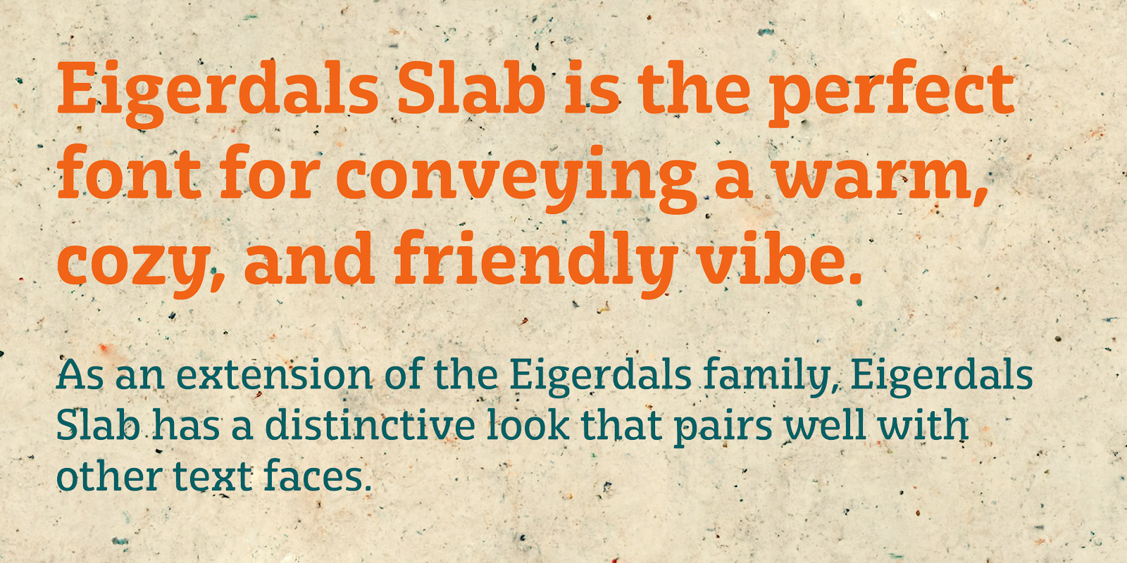
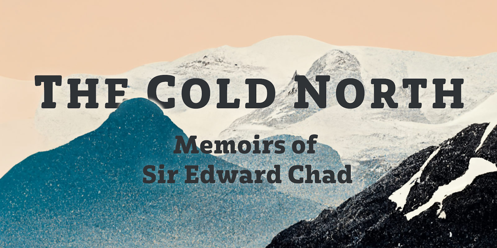
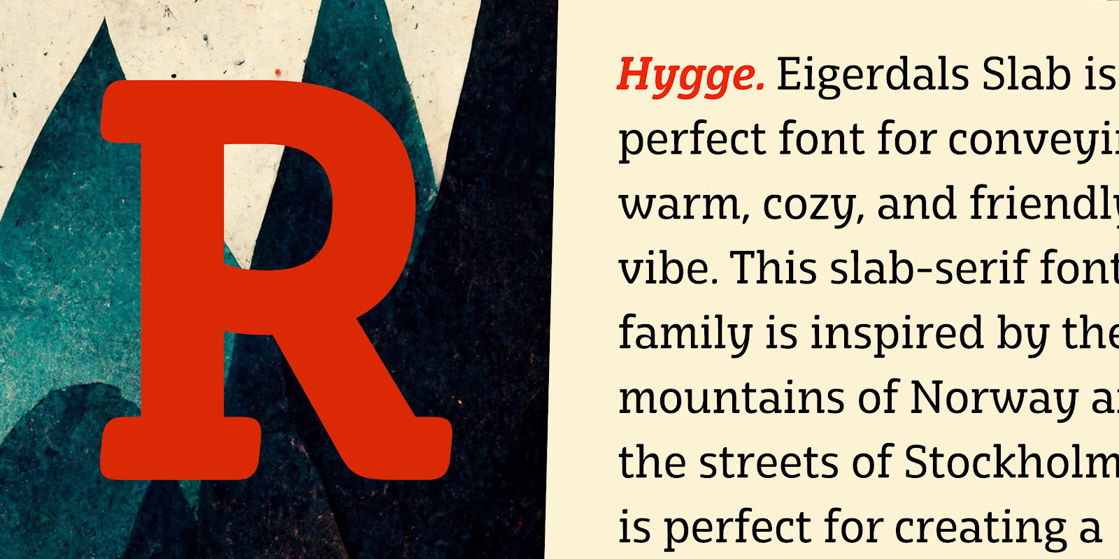
Introducing Eigerdals Slab - the ultimate font for creating a cozy and inviting atmosphere in your designs. This slab-serif font family captures the essence of the mountains of Norway and the streets of Stockholm, making it the perfect choice for design projects that need a touch of Hygge. With its top-heavy characters, Eigerdals Slab has a more approachable and warm feel that sets it apart from other font choices. Plus, its tall x-height, brushed and smooth look makes it both readable and stylish.

But that's not all, Eigerdals Slab comes loaded with practical OpenType features like ligatures, unicase alternates, and a set of upright italic swash alternates, that can be fully utilized in software like Quark and Adobe suite. Not only that, it also includes support for a wide range of languages.

Eigerdals Slab is an extension of the Eigerdals family, and its distinctive look pairs perfectly with other text faces. Whether you're using it for display work or longer blocks of text, Eigerdals Slab is the perfect font for adding warmth and friendliness to your designs. Don't wait any longer, try Eigerdals Slab today and elevate your work to the next level!

60% off for a limited time.

Comments

Popular posts from this blog

Carta Marina

Carta Marina is based on the titling found on the famous map drawn by Olaus Magnus in 1539. The map of northern Europe took 12 years to complete, and the total size is a huge 1.7 meters tall by 1.25 meters wide. More information about the map, as well as the high resolution reference document used to create the typeface and illustration set can be found at the James Ford Bell Library, University of Minnesota. The titling is slightly aged, very sturdy and elegant. Carta Marina includes a full set of OpenType alternates for every character in the English alphabet, oldstyle figures, historical forms, small caps and 64 discretionary ligatures. These ligatures are used to alter the appearance of the type so that the printing appears realistic and without any duplicate letters to detract from the antique appearance. The Carta Marina family also includes some of the unique illustrations that give the map much of its character. It includes depictions of fanciful sea creatures, land animals a

Guerilla Marketing

Just recently, I was wondering why we don’t see more of... ...this... ...this... ...this... ...this... and this here in the states. Yes, guerilla marketing. As you can see, all of these images don’t have their point of origin here in the USA. Then, I got my answer . Seriously, when looking at few of these campaigns, although they are clever and probably very effective, some of them seem destructive and disruptive. I think that American advertisers recognize this, and understood that American culture doesn’t have time or allow disruptions or annoyances, making it a tactic that is rarely used stateside. There are also probably some legal, or rather enforcement reasons that make it more common overseas. Any other thoughts? Everything with the exception of AXE via adgoodness . AXE via ibeliveinadv .

DevChatt

I had the chance to talk to a group of developers at DevChatt 11. I spoke on webfonts. The talk was recorded, so hopefully I can put the audio up soon. The presentation is available here: I am very happy about my move to Chattanooga (in addition to moving here to be with my wife). There are some tremendous things happening, and a very strong entrepreneurial spirit abounds. After attending DevChatt, I was inspired to brush off a few business ideas and I hope to develop these further. One is related to my core competency, typography, while the other is in a totally different field. I was also inspired by listening to Ale Paul and Luc De Groot in New York City this past week. Here are a few links to some inspiring local organizations: DevChatt CreateHere costarters.co Chattarati colab.is