
Atarimae, the hint is to use Kaeswaii when you want to infuse your products with a dash of inspiration and delight.


Introducing Kaeswaii, a font that is ideal for anyone wishing to infuse their creations with a dash of inspiration and delight. It's ideal for producing fresh designs that will stand out thanks to its unique horizontal contrast. It has a joyful feel on account of its tall x-height, and its playful terminals give it a funky touch.

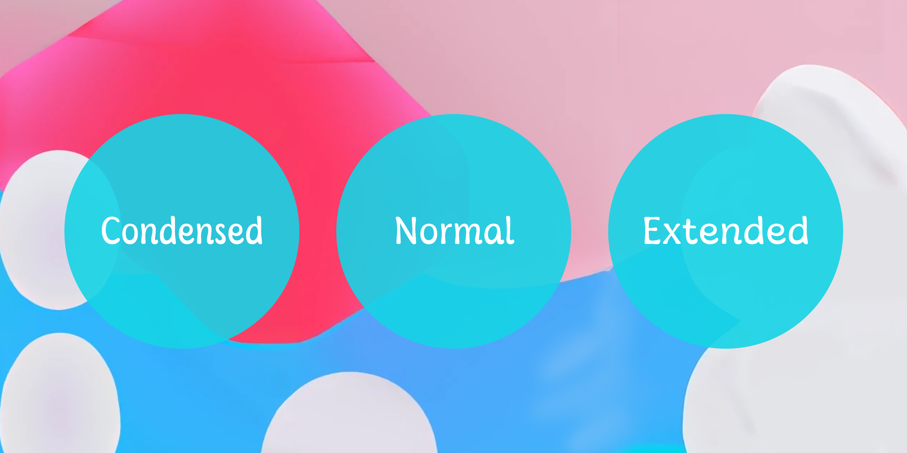
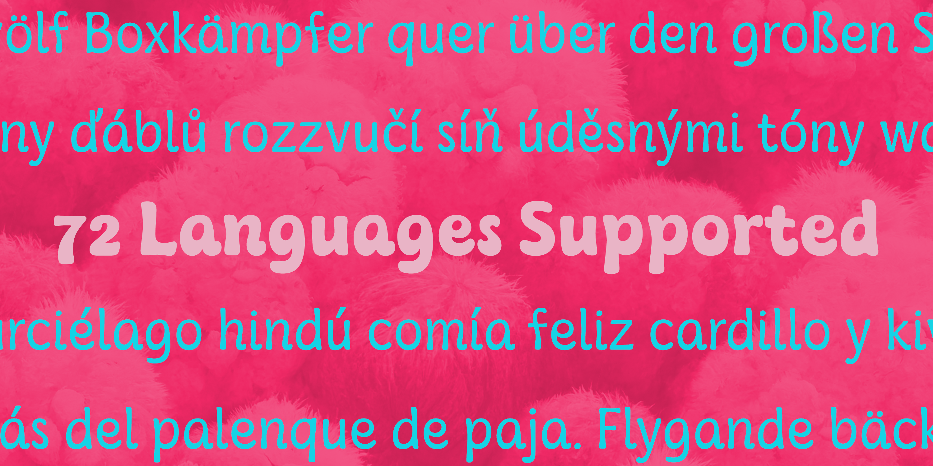
Kaeswaii has enough variety to help your project look better than the rest with forty-eight different styles. Select from nine weights and italics for the standard, condensed, and extended styles. It has rounded corners and a luscious texture and a squishy, gloopy vibe.

Atarimae, the hint is to use Kaeswaii when you want to infuse your products with a dash of inspiration and delight. It's ideal for producing fresh designs. Put a playful spin on your work with the unique personality of Kaeswaii's rounded terminals. Let Kaeswaii bring life to your ideas!

Available from Myfonts.com


Comments

Popular posts from this blog

Microsoft Expression

I have been trying out the Microsoft Expression web design program recently. My final verdict: I like it better than Dreamweaver. I’ve been using Dreamweaver for 5 years now, but where Expressions really shines is its handling of CSS, which is, in my mind, quite a bit better than Dreamweaver. My “problem” with CSS as opposed to tables is that with tables you can visualize what you are doing. CSS is a bit more programmatic. Expression helps a bit. If you are looking to save some money, and you use a PC, you should download Visual Web Developer. You can do some very advanced stuff with this program, and the interface is very much like Expressions. The price is right: free! However, Expression is more intuitive in how it handles CSS. It’s very interesting how Microsoft is starting to head into Adobe’s turf. Microsoft is working on equivalents to everything in Adobe’s product line. My long term bet is on Microsoft.

New from insigne: Aviano Contrast

The Aviano series returns, refined and sophisticated with an extended, high-contrast sans-serif family.  Aviano Contrast is a contemporary typeface radiating with luxury. It’s classic elegance makes it perfect for high-end applications such as cosmetic, jewelry or fashion brands. Aviano Contrast’s extended forms give the face a smart look, and the curves are carefully honed to be sinuous and seductive. This high-contrast face is in a class of its own, composed in the style of a classic Didone but lacking the typical serifs. Aviano Contrast comes in six different weights and is packed with OpenType features. Need swash forms? Ball terminals? Art Deco alternates inspired by the inscriptions and signage of the ’20s and ’30s? Aviano Contrast includes 230 alternate characters. Twelve style sets are available, including four complete sets of art deco-inspired alternates, small forms, swash, titling and a wide array of other alternates to make your designs unique. As a complement t...

New from insigne: Mynaruse

Mynaruse is an elegant and regal roman inscriptional titling family. It has sharp and elongated serifs that give the face extra punch. The face shines in settings that call for elegance and splendor. Mynaruse’s six weights range from a fine, delicate thin to a powerful and solid heavy weight. Mynaruse includes many useful OpenType features, including a set of swash alternates, alternate titling forms, ligatures and miscellaneous alternates. OpenType-capable applications such as Quark or the Adobe suite can take full advantage of the automatically replacing ligatures and alternates. This family also includes the glyphs to support a wide range of languages. Mynaruse is 1/3rd off for a limited time!