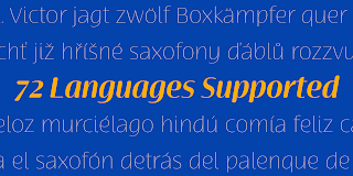
Terfens Contrast, influenced by chancery script.


Terfens draws influence from chancery scripts, updating it for the twenty-first century. Terfens Contrast is derived from Terfens' DNA and retains its humanist tone. It’s tall x-height gives it a friendly but not informal feel.


With Terfen Contrast, calligraphy-inspired letterforms are rendered with a high contrast nib, lending raw vitality and expressivity. This juxtaposition gives the letters a sense of firmness and energy, but also of heavenly, delicate beauty.

Terfens is a full-service branding and packaging solution, containing a lot of personality, combining the passion of a broad nib pen with the beauty of a brush. Terfens is a "workhorse typeface" comprising 48 typefaces in three widths and eight weights. There are ligatures and swashes in all weights, as well as support for more than 72 languages. Another powerful typeface to add to your collection of eye-catching fonts.

• Recommended uses: modern branding and logo design, powerful editorial design, exciting packaging, and a wide range of additional jobs.

• 54 font styles, including eight weights, eight italics, and three widths.

• Each weight has 500+ glyphs.

Useful Opentype features include: Access All Alternates, Discretionary Ligatures, Denominators, Fractions, Kerning, Standard Ligatures, Lining Figures, Numerators, Oldstyle Figures, Ordinals, Scientific Inferiors, Subscript and Superscript.

Comments

Popular posts from this blog

Guerilla Marketing

Just recently, I was wondering why we don’t see more of... ...this... ...this... ...this... ...this... and this here in the states. Yes, guerilla marketing. As you can see, all of these images don’t have their point of origin here in the USA. Then, I got my answer . Seriously, when looking at few of these campaigns, although they are clever and probably very effective, some of them seem destructive and disruptive. I think that American advertisers recognize this, and understood that American culture doesn’t have time or allow disruptions or annoyances, making it a tactic that is rarely used stateside. There are also probably some legal, or rather enforcement reasons that make it more common overseas. Any other thoughts? Everything with the exception of AXE via adgoodness . AXE via ibeliveinadv .

Mandrel Didone is not weak in the face of adversity.

A new family has sprung from the world of insigne. Mandrel Didone is his name. The face is well-liked by those with whom it seeks an audience because of its courtly demeanor and exquisite look. Mandrel Didone conducts itself beautifully in front of each set of eyes with a confident attitude, never wavering or tripping in its polished step. But, despite it’s gentility, this exquisite family is not weak in the face of adversity. Mandrel Didone is a powerful and conspicuous typeface that has towering x-heights, great contrast, confident bends, and sharp serifs. It is well-crafted for high-impact resistance. It uses its sharp serif ends deftly, cutting through opponents' clumsy clutter in the battle for the reader's attention. This noble family consists of nine weights and their matching italics, ranging from Thin to Black. Mandrel Didone also comes with a plethora of OpenType options to let you embellish your text. The family's 500 glyphs and support for more than 70 languages

Balance friendliness and elegance with the look of Cabrito Contrast.

The Cabrito family is back again to make a statement. Released as a complement to the children's book, The Clothes Letters Wear , the original Cabrito is light-hearted, fun, and easy to read. Now, balancing this friendliness with a new elegance, Cabrito Contrast steps forward--a handsome typeface with an extra-sophisticated sensibility injected into the design. Still bright and playful in its Cabrito ancestry, this new Cabrito member approaches the field with a cleaner, more reductionist form, ensuring that its polished look retains the readability. Regular features and Italic forms of the 54 fonts include upright alternates, ligatures, and old figures. A range of weights include extended and condensed variants. To preview any of these interactive features, see the PDF manual. The family also includes language support for 72 Latin-based languages, and there are over 600 glyphs for further refining your work. Cabrito Contrast is best