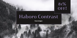
Gentle in approach. Confident in refined appearance.


Meet Haboro Contrast, the stylish little sister of the Haboro hyperfamily. While built from the same clean, geometric shapes of Haboro Sans, this new addition has been rebalanced for elegant performance with her high-contrast sans letterforms and has been adjusted to provide the greatest impact for each weight. It's a personality all her own, gentle in approach yet refined and modern with a confident appearance.

Capitalize on Contrast's style with OpenType features, too. Packed with options like OpenType ligatures, stylistic sets, fractions, crafted small caps and old-fashioned figures, this font will keep your work fresh and attractive. If you need even more combinations for the right statement, use the entire Haboro hyperfamily and create the right balance to capture your reader's eye.

Haboro Contrast (along with the rest of the Haboro family) has been tested for the web and is ready for use in both print and digital applications. Designed to serve as a display character for such publishing projects as magazines and company brochures, Contrast gives you comfort in having a great amount of versatility in the fonts you rely on. It's a prime example where high contrast simplicity lends itself to achieve excellent design results.

Comments

Popular posts from this blog

Microsoft Expression

I have been trying out the Microsoft Expression web design program recently. My final verdict: I like it better than Dreamweaver. I’ve been using Dreamweaver for 5 years now, but where Expressions really shines is its handling of CSS, which is, in my mind, quite a bit better than Dreamweaver. My “problem” with CSS as opposed to tables is that with tables you can visualize what you are doing. CSS is a bit more programmatic. Expression helps a bit. If you are looking to save some money, and you use a PC, you should download Visual Web Developer. You can do some very advanced stuff with this program, and the interface is very much like Expressions. The price is right: free! However, Expression is more intuitive in how it handles CSS. It’s very interesting how Microsoft is starting to head into Adobe’s turf. Microsoft is working on equivalents to everything in Adobe’s product line. My long term bet is on Microsoft.

Carta Marina

Carta Marina is based on the titling found on the famous map drawn by Olaus Magnus in 1539. The map of northern Europe took 12 years to complete, and the total size is a huge 1.7 meters tall by 1.25 meters wide. More information about the map, as well as the high resolution reference document used to create the typeface and illustration set can be found at the James Ford Bell Library, University of Minnesota. The titling is slightly aged, very sturdy and elegant. Carta Marina includes a full set of OpenType alternates for every character in the English alphabet, oldstyle figures, historical forms, small caps and 64 discretionary ligatures. These ligatures are used to alter the appearance of the type so that the printing appears realistic and without any duplicate letters to detract from the antique appearance. The Carta Marina family also includes some of the unique illustrations that give the map much of its character. It includes depictions of fanciful sea creatures, land animals a

New from insigne: Mynaruse

Mynaruse is an elegant and regal roman inscriptional titling family. It has sharp and elongated serifs that give the face extra punch. The face shines in settings that call for elegance and splendor. Mynaruse’s six weights range from a fine, delicate thin to a powerful and solid heavy weight. Mynaruse includes many useful OpenType features, including a set of swash alternates, alternate titling forms, ligatures and miscellaneous alternates. OpenType-capable applications such as Quark or the Adobe suite can take full advantage of the automatically replacing ligatures and alternates. This family also includes the glyphs to support a wide range of languages. Mynaruse is 1/3rd off for a limited time!