Introducing Enocenta, a script for the wild and untamed heart.


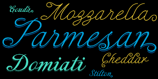
Enocenta is fully featured script face. Like a wild, untamed beauty in the moonlight, Enocenta’s flowing calligraphy dances across the page. This contemporary typeface is not slavishly devoted to convention, and instead it defies it repeatedly. The face has bit more character than most high contrast script faces and attracts your readers eye.

This spicy and flavorful collaboration between Jeremy Dooley and Cecilia Marina Pezoa. Enocenta is a five weight script typeface that offers a variety of options for you to design beautiful things. Enocenta is friendly and warm, and it's hairline weight is simple and clean while its bold is strong and draws attention.

Enocenta’s contemporary appearance is right home on the web or wherever your canvas may be, whether that is packaging, magazines and invitations. It's also a fantastic choice for branding and can be quickly converted into a distinctive logo when applying its options to customize the look and feel so the brand is unique.

Enocenta is packed with alternates, swashes, ligatures, and also other techy perks. To discover its complete feature set, please use it with software that supports OpenType options for sophisticated typography.

There are a number of purchase options for the face. The Pro fonts are loaded with the full set of alternates, ligatures and ornaments. The Standard types are contain no decorative alternates but are an affordable starting point for designers that don't need the full features.


Comments

Popular posts from this blog

Guerilla Marketing

Just recently, I was wondering why we don’t see more of... ...this... ...this... ...this... ...this... and this here in the states. Yes, guerilla marketing. As you can see, all of these images don’t have their point of origin here in the USA. Then, I got my answer . Seriously, when looking at few of these campaigns, although they are clever and probably very effective, some of them seem destructive and disruptive. I think that American advertisers recognize this, and understood that American culture doesn’t have time or allow disruptions or annoyances, making it a tactic that is rarely used stateside. There are also probably some legal, or rather enforcement reasons that make it more common overseas. Any other thoughts? Everything with the exception of AXE via adgoodness . AXE via ibeliveinadv .

DevChatt

I had the chance to talk to a group of developers at DevChatt 11. I spoke on webfonts. The talk was recorded, so hopefully I can put the audio up soon. The presentation is available here: I am very happy about my move to Chattanooga (in addition to moving here to be with my wife). There are some tremendous things happening, and a very strong entrepreneurial spirit abounds. After attending DevChatt, I was inspired to brush off a few business ideas and I hope to develop these further. One is related to my core competency, typography, while the other is in a totally different field. I was also inspired by listening to Ale Paul and Luc De Groot in New York City this past week. Here are a few links to some inspiring local organizations: DevChatt CreateHere costarters.co Chattarati colab.is

Mandrel Didone is not weak in the face of adversity.

A new family has sprung from the world of insigne. Mandrel Didone is his name. The face is well-liked by those with whom it seeks an audience because of its courtly demeanor and exquisite look. Mandrel Didone conducts itself beautifully in front of each set of eyes with a confident attitude, never wavering or tripping in its polished step. But, despite it’s gentility, this exquisite family is not weak in the face of adversity. Mandrel Didone is a powerful and conspicuous typeface that has towering x-heights, great contrast, confident bends, and sharp serifs. It is well-crafted for high-impact resistance. It uses its sharp serif ends deftly, cutting through opponents' clumsy clutter in the battle for the reader's attention. This noble family consists of nine weights and their matching italics, ranging from Thin to Black. Mandrel Didone also comes with a plethora of OpenType options to let you embellish your text. The family's 500 glyphs and support for more than 70 languages