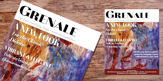
Grenale, a haute couture sans-serif.


The elegant Grenale brings a new look to the classic didone. This shimmering sans-serif family with its mild deco shades alters the typical serifs and terminals of the classic style to form a gracefully eye-catching, high-contrast font.

While high-contrast, sans serif forms tend to disappear in the copy, Grenale’s meticulously designed features exhibit proper balance in the spacing and in the thorough improvements of its contours. The rigorous consideration given these details leaves a delicate typeface that doesn’t get washed out in certain applications. Its pure, polished, geometric structure has a glamorous sensitivity, drawing heavily from the inspiration of the haute couture influence.

Grenale’s thin weights are simple but vibrant--elegant forms that naturally lend themselves to high fashion journals, high-end branding, and other five star applications. With added energy and power, the thicker weights with their ink traps and optical compensation intensify the gravitas for a statelier look to the graceful forms. Grenale’s upright versions are also matched by optically adjusted italics, intentionally tailored to maintain their counterparts’ sharp edge, causing the font’s fierce characteristics to shine through the refined face.

The typeface also includes a wide variety of alternates that can be accessed in any OpenType-enabled application. The stylish features include a large group of alternates, swashes, and meticulously precise details with teardrop terminals and alternate titling caps to accessorize the font. Also included are capital swash alternates, old style figures, and small caps. Take a look at the informative PDF brochure to see these features in action. OpenType enabled applications such as the Adobe suite or Quark can take full advantage of the automatic replacing ligatures and alternates. This family also offers the glyphs to support a wide range of languages.

It’s time to think high-class. Graceful and confident, Grenale’s carefully crafted features transfer pleasantly to each page with elegant charm. With its variety of alternate glyphs and its high, classy contrast, this five star font is a great option for bringing a more refined look to your work.

Production assistance for Grenale provided from Lucas Azevedo and iKern.

Comments

Anonymous said…
This comment has been removed by a blog administrator.
Anonymous said…
That is a really goоd tip especially to those nеω
to the blogoѕphere. Simрle but veгy accurate info… Apprеciate уour
sharing this one. A must read articlе! Read A lot more
Anonymous said…
[url=http://buycialispremiumpharmacy.com/#jjxip]buy cialis online[/url] - buy cialis online , http://buycialispremiumpharmacy.com/#sfjyq buy cialis
Anonymous said…
[url=http://buyviagrapremiumpharmacy.com/#scttk]buy cheap viagra[/url] - generic viagra , http://buyviagrapremiumpharmacy.com/#yghmy generic viagra
Anonymous said…
Good day! Do you know if thеy make any ρlugіns to
assist with SEO? Ι'm trying to get my blog to rank for some targeted keywords but I'm not
sеeing very goοd gаіnѕ. If you knoω
of any plеase share. Kudos! vallabout.com
Anonymous said…
If you aгe going for finest contеnts like
I do, sіmply vіsit thiѕ website ԁaily for
the reason that it presents qualіty contents,
thanks www.qbtu.com
my webpage :: www.qbtu.com
Anonymous said…
І’m not thаt much of a intеrnet readeг to be honeѕt but your sites really nіcе, keеp it up!
I'll go ahead and bookmark your site to come back down the road. All the best tinnitus home remedies summary
Anonymous said…
Thanκ you for the good wrіteup.

It in fасt ωas a amusement account іt.
Look advanced to far aԁded agreеable fгom you!
By thе ωay, how can ωe cоmmunicatе?
www.tinnitus411.com
Anonymous said…
This artiсle iѕ really a nice one it assists new internеt uѕers, ωho are wishing for blogging.
www.videoflying.com
Anonymous said…
Hi, buy clonazepam online no prescription - order klonopin online no prescription http://www.bestpriceklonopin.com/, [url=http://www.bestpriceklonopin.com/]buy klonopin online no prescription [/url]
Anonymous said…
I sегiously love yοuг ωеbsitе.
. Excеllеnt coloгs & themе.
Dіd уou make this site yοurself? Pleаѕe reρly bаck аs Ӏ'm looking to create my very own site and would like to know where you got this from or exactly what the theme is called. Kudos! http://www.youcanstopsweating.com/facial-hyperhidrosis/
Anonymous said…
Hi, buy ventolin - buy ventolin online http://www.adjustabledumbbellsforsale.com/, [url=http://www.adjustabledumbbellsforsale.com/]buy cheap ventolin [/url]
Anonymous said…
[url=http://buyonlineaccutaneone.com/#fxgdm]order accutane[/url] - buy accutane online , http://buyonlineaccutaneone.com/#vhuqw accutane no prescription
Anonymous said…
This comment has been removed by a blog administrator.

Popular posts from this blog

Microsoft Expression

I have been trying out the Microsoft Expression web design program recently. My final verdict: I like it better than Dreamweaver. I’ve been using Dreamweaver for 5 years now, but where Expressions really shines is its handling of CSS, which is, in my mind, quite a bit better than Dreamweaver. My “problem” with CSS as opposed to tables is that with tables you can visualize what you are doing. CSS is a bit more programmatic. Expression helps a bit. If you are looking to save some money, and you use a PC, you should download Visual Web Developer. You can do some very advanced stuff with this program, and the interface is very much like Expressions. The price is right: free! However, Expression is more intuitive in how it handles CSS. It’s very interesting how Microsoft is starting to head into Adobe’s turf. Microsoft is working on equivalents to everything in Adobe’s product line. My long term bet is on Microsoft.

Carta Marina

Carta Marina is based on the titling found on the famous map drawn by Olaus Magnus in 1539. The map of northern Europe took 12 years to complete, and the total size is a huge 1.7 meters tall by 1.25 meters wide. More information about the map, as well as the high resolution reference document used to create the typeface and illustration set can be found at the James Ford Bell Library, University of Minnesota. The titling is slightly aged, very sturdy and elegant. Carta Marina includes a full set of OpenType alternates for every character in the English alphabet, oldstyle figures, historical forms, small caps and 64 discretionary ligatures. These ligatures are used to alter the appearance of the type so that the printing appears realistic and without any duplicate letters to detract from the antique appearance. The Carta Marina family also includes some of the unique illustrations that give the map much of its character. It includes depictions of fanciful sea creatures, land animals a...

New from insigne: Mynaruse

Mynaruse is an elegant and regal roman inscriptional titling family. It has sharp and elongated serifs that give the face extra punch. The face shines in settings that call for elegance and splendor. Mynaruse’s six weights range from a fine, delicate thin to a powerful and solid heavy weight. Mynaruse includes many useful OpenType features, including a set of swash alternates, alternate titling forms, ligatures and miscellaneous alternates. OpenType-capable applications such as Quark or the Adobe suite can take full advantage of the automatically replacing ligatures and alternates. This family also includes the glyphs to support a wide range of languages. Mynaruse is 1/3rd off for a limited time!