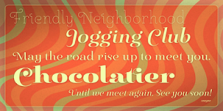
New from insigne: Pauline Didone

An Art Deco and script inspired typeface for “modern” times, Pauline Didone is a full type family with a unique and flavorful design. It has a sense of femininity and naïveté that comes from its predecessor, Pauline. It’s a typeface useful for short bits of copy, logotypes and interesting titling. This typeface family of 10 different fonts includes 5 weights and their italics and a wide range of OpenType alternates.


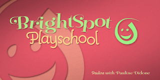
The original Pauline was inspired by and has a strong influence from retro scripts. The typeface is geometric, formed with deliberate contrasting brush strokes and a ostentatious flair. Pauline Didone's high contrast strokes give it a very interesting look that is up to date with latest design trends and very useful for today's design environment. Pauline Didone pairs nicely with the original sans-serif Pauline.


The typeface family also includes a full array of alternate forms, including over 150 alternate characters. These alternates can be accessed by activating OpenType features and style sets.   In order to use these features, you will need a program with advanced typography capabilities such as the Adobe Suite or Quark. These alternates also include a group of ball terminals that can be accessed under the swash alternates.


Pauline Didone is the latest in a trusted line of typefaces from insigne. Why settle for the ordinary when you can choose Pauline Didone to lend its unique look to your art work?

Comments

Popular posts from this blog

Microsoft Expression

I have been trying out the Microsoft Expression web design program recently. My final verdict: I like it better than Dreamweaver. I’ve been using Dreamweaver for 5 years now, but where Expressions really shines is its handling of CSS, which is, in my mind, quite a bit better than Dreamweaver. My “problem” with CSS as opposed to tables is that with tables you can visualize what you are doing. CSS is a bit more programmatic. Expression helps a bit. If you are looking to save some money, and you use a PC, you should download Visual Web Developer. You can do some very advanced stuff with this program, and the interface is very much like Expressions. The price is right: free! However, Expression is more intuitive in how it handles CSS. It’s very interesting how Microsoft is starting to head into Adobe’s turf. Microsoft is working on equivalents to everything in Adobe’s product line. My long term bet is on Microsoft.

Carta Marina

Carta Marina is based on the titling found on the famous map drawn by Olaus Magnus in 1539. The map of northern Europe took 12 years to complete, and the total size is a huge 1.7 meters tall by 1.25 meters wide. More information about the map, as well as the high resolution reference document used to create the typeface and illustration set can be found at the James Ford Bell Library, University of Minnesota. The titling is slightly aged, very sturdy and elegant. Carta Marina includes a full set of OpenType alternates for every character in the English alphabet, oldstyle figures, historical forms, small caps and 64 discretionary ligatures. These ligatures are used to alter the appearance of the type so that the printing appears realistic and without any duplicate letters to detract from the antique appearance. The Carta Marina family also includes some of the unique illustrations that give the map much of its character. It includes depictions of fanciful sea creatures, land animals a...

New from insigne: Mynaruse

Mynaruse is an elegant and regal roman inscriptional titling family. It has sharp and elongated serifs that give the face extra punch. The face shines in settings that call for elegance and splendor. Mynaruse’s six weights range from a fine, delicate thin to a powerful and solid heavy weight. Mynaruse includes many useful OpenType features, including a set of swash alternates, alternate titling forms, ligatures and miscellaneous alternates. OpenType-capable applications such as Quark or the Adobe suite can take full advantage of the automatically replacing ligatures and alternates. This family also includes the glyphs to support a wide range of languages. Mynaruse is 1/3rd off for a limited time!